Heatherwick Studio was commissioned to design a new Centre at St James’s University Hospital in Leeds. Jimmy’s, as it is known locally, is Europe’s largest teaching hospital and home to the Leeds Cancer Centre. It serves a diverse community across Yorkshire. Maggie’s Centres are places, where cancer patients and their friends, and families visit to find free practical and emotional support.
Heatherwick Studio is currently working on 30 live projects in ten countries. These projects include ‘Lantern House’, ‘a new residential building for Related in Manhattan’, ‘Little Island at Pier 55’, ‘a new park and performance space in New York due to complete in spring 2021’, as well as, ‘major new headquarters for Google in Silicon Valley and London’ (in collaboration with BIG). The projects are currently under construction.
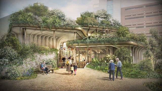
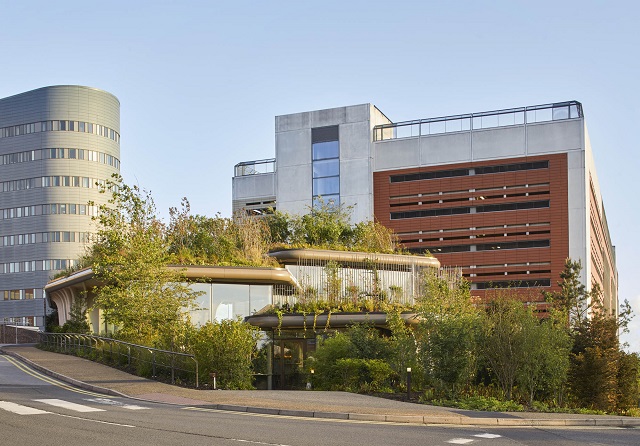
The last patch of greenery at the hospital was chosen for the new Maggie’s Centre was. A grassy hill next to the car park, bounded by roads on two sides and surrounded by large buildings made the design creation look more interesting. The Studio chose to follow its natural contours, so that at the highest point, visitors would have lovely views of the Yorkshire Dales.
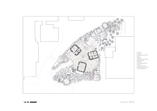
The pillars of support at Maggie’s are the Counselling rooms, so these were placed like three pavilions, organized around a heart and at changing levels of the slope. The space between them accommodates the common areas of the Centre, resulting in an inviting open space, simple for visitors to navigate, connecting all the areas to the garden. Thereby giving the building a different character from every angle externally. Two entrances, one for the staff and the other for regular visitors were designed for a smooth circulation.
It was a challenging task for the design team to span and enclose the level changes and reinstate the greenery. However, a well-thought design creation was incorporated. Instead of a single monolithic canopy, the roof is composed of three overlapping gardens which step down and overhang to shelter communal areas. The designing team made sure that the hospital does not lose its last green space. It is lifted up, filled with woodland plants and made more accessible and inviting.
The relationship between the Centre’s architecture and the experience for visitors extends beyond the uplifting effect of its garden. For example, the front door is a psychological threshold – the point at which someone might start to accept a cancer diagnosis. A bench is placed to sit outside, or a private path to wander quietly through the gardens, so that no one has to open the door straight away. The entrance wall is transparent and the door is moved to the side under a lower roof, where it is less intimidating.
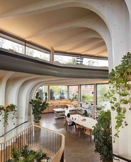
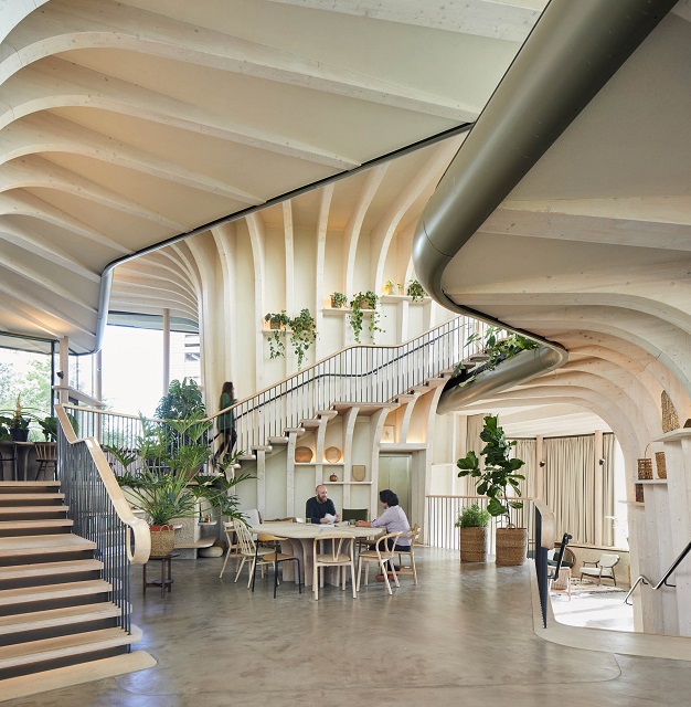
Inside, visitors are not confronted by a conventional reception space. Instead, they find a welcoming window seat, a notice board, and a view through to the heart of the Centre, with its communal table in the arc of a staircase leading to the kitchen. The kitchen table, a feature of all Maggie’s Centres, represents another threshold. It is the point, where visitors feel ready to share their experiences. Everything is on display, so there is no awkward rummaging through cupboards to find a mug and a clerestory fills the space with natural light. Above this, there is a private space for staff to rest and gather strength, and a sheltered roof garden accessible to all.
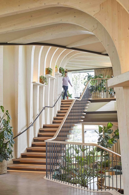
The road running along the site presented a challenge for the building’s construction since it was the main ambulance route. The construction heavy vehicles would have been a disaster. So, Heatherwick Studio designed a structure that could be built off-site and assembled quickly on a concrete slab, all the while retaining wall with minimal disruption. The entire building superstructure was manufactured in Switzerland and fixed together on site in just eight weeks. These are supported by glulam fins, whose modulations give the feeling of trunks rising up from the ground to support the gardens overhead. The structure is mostly made of sustainably forested spruce, a material that will expand and contract with the seasons, as if alive.
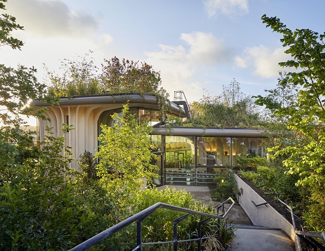
The Studio looked at all the qualities that make a building a home. The team made use of warm, natural materials, the way that objects are used to express individuality, the combination of private spaces and places where people can come together, and gentle lighting. Between the timber fins are shelves, lined, as you might at home, with nick-knacks, pot plants and the interesting things that people bring to the Centre.
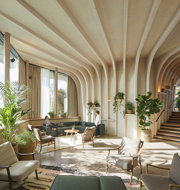
When it came to lighting, the studio had the idea that the wooden cores could glow, as if they were emitting light. This was achieved by integrating the lighting with the shelves and interior edges of the roofs. The designers had to work backwards, specifying how the lights, and services would be integrated at an early stage in the process, as the building was still taking shape.
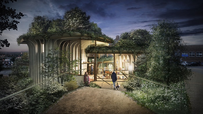
Image Courtesy: Heatherwick Studio
Photographer: Hufton Crow