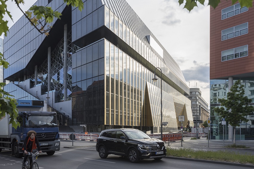
Axel Springer’s new building on the campus in Berlin, Germany is symbolic in nature as the media house makes their transition from the ‘Print’ to the ‘Digital Media’. The spectacular structure designed by Chris van Duijn, Partner and Asia Head of OMA – lures the elite of Germany’s digital bohemia.
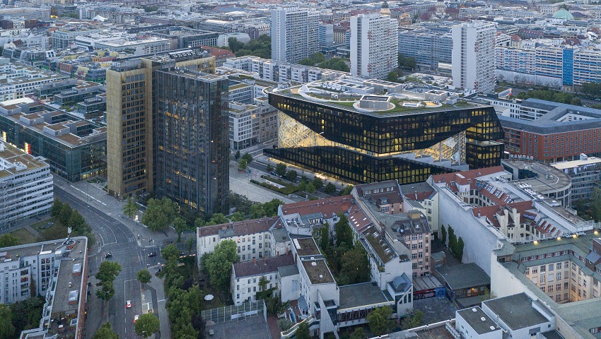
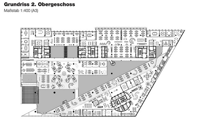
The design creation bisects a diagonal atrium to open up the existing Axel Springer buildings, thereby creating a series of terraced floors to form a ‘valley’ that creates an informal stage at the centre – a place to broadcast ideas to other parts of the company.
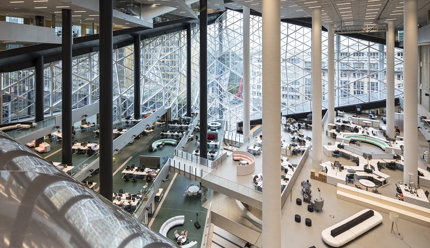
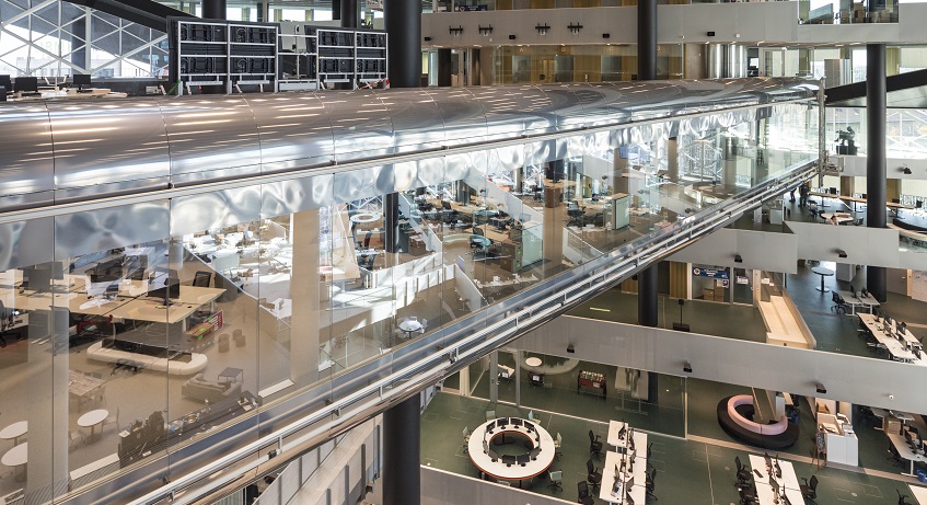
The design was developed around a series of terraced floors that together form a digital valley. Each floor contains a covered part as a traditional work environment, which is then uncovered on the terraces. Halfway through the building, the valley is mirrored to generate a three dimensional canopy.
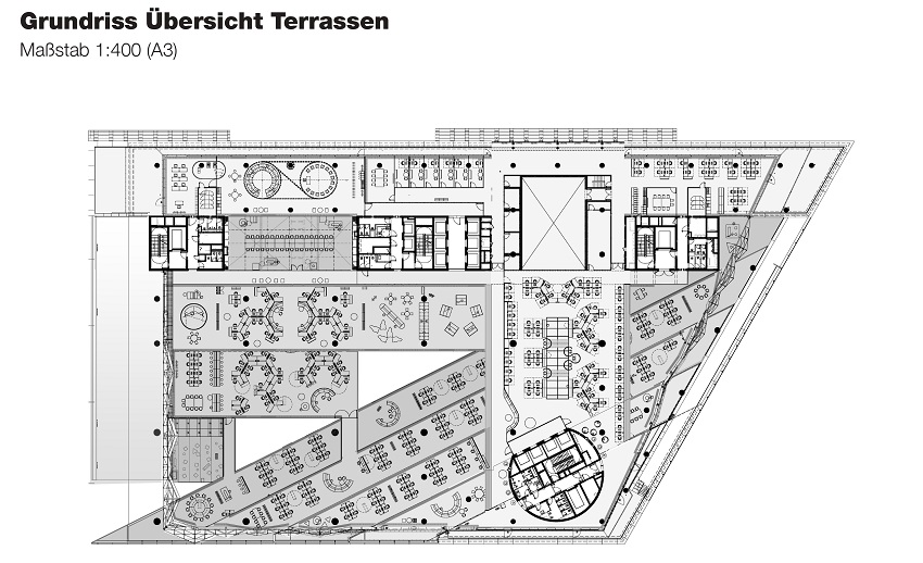
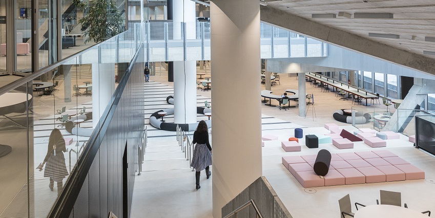
The common space formed by the interconnected terraces offers an alternative to the formal office space in the solid part of the building, allowing for an unprecedented expansion of the vocabulary of workspaces – a building that can absorb all the question marks of the digital future.
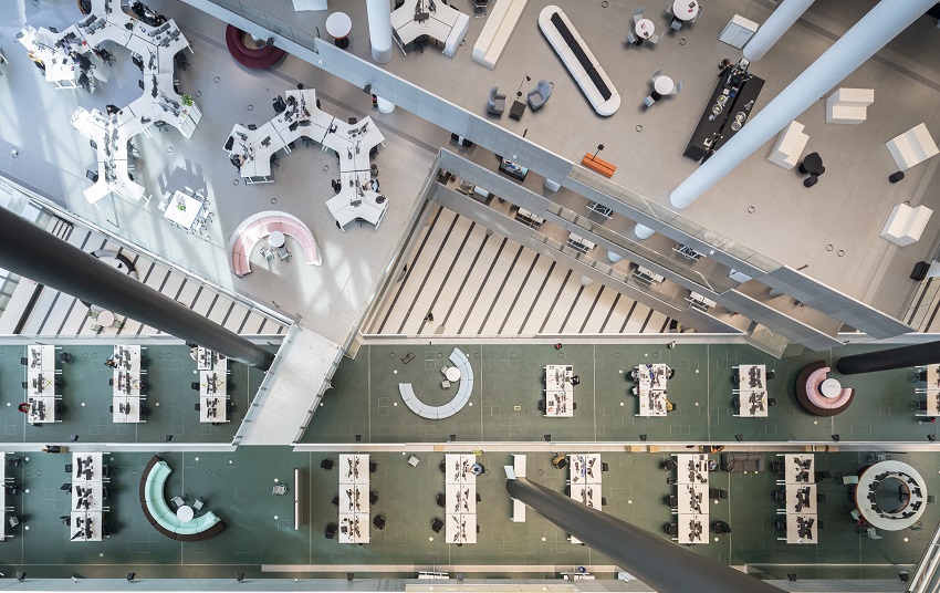
The public can experience the building on three levels – ground floor lobby, meeting bridge, and roof-top bar.
The meeting bridge is a viewing platform from which the visitors can witness the daily functioning of the company and how it evolves.
The ground floor contains studios, event and exhibition spaces, canteens and restaurants.
The building is situated opposite the existing Axel Springer headquarters on Zimmerstrasse, a street which previously separated East and West Berlin, at one of the city’s most significant locations.
“When we started working on project, Axel Springer was still an old-fashioned media company, like in the times when cigar smoking journalists would spend their day behind a typewriter. At the same time, Axel Springer’s new media and tech startups were making the majority of the turnover and were therefore becoming the future of the company.
The challenge of the project was to make these companies feel welcome by creating a working environment, which provides the energy they need and which broadcasts this energy to its surroundings.” – Chris van Duijn, Partner, Asia Head, OMA
About the project’s design, Chris van Duijn explains, “Our interaction with the client consisted of daily meetings with various heads of the traditional company. While their CEO was clear about his ambition, the client team’s point of reference was the traditional workspace, with the traditional way of working, the traditional norms and the traditional secretary. What we designed was simply different, as it was supposed to be different.”
Elegance of design: The project has many narratives to tell and show related to Berlin’s incredible history as an historical capital, its monolithic architecture and the fact that the Wall was running right through the center of our site, but also how these massive volumes we designed are adjusted to the surroundings streets with subtle and less subtle details.
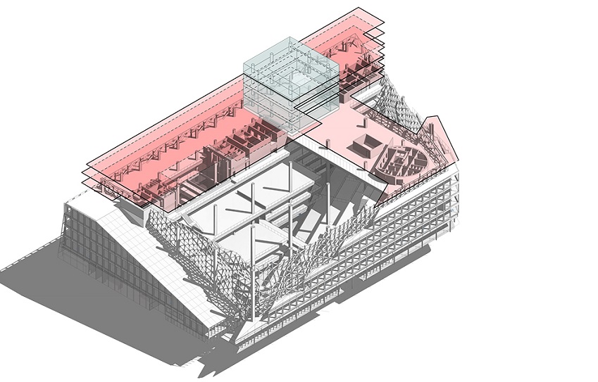
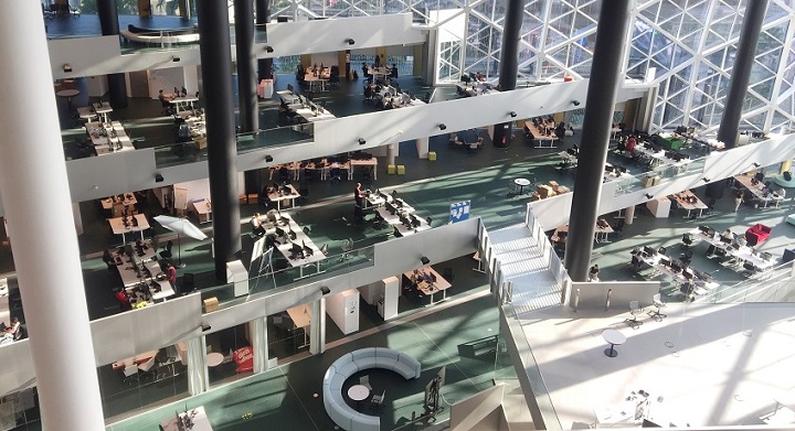
The main feature of the design is the central atrium, which connects the surrounding streets, and hosts flexible working spaces for all companies of Axel Springer.
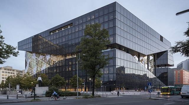
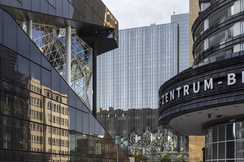
The façade and the atrium are keys to the way the building functions. The main office façade is a compact, double-skin façade which controls the amount of sunlight in the building through silk-screened black glass panels. Meanwhile, the inner façade includes operable panels to ensure natural ventilation. The combination of the two façades allows the building to take maximum advantage of daylight, while having a very good energy performance.
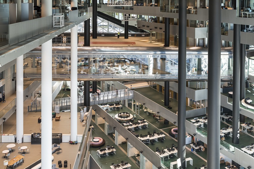
The double-skin façade allows the building’s users to extend the period, during which they can make use of natural ventilation throughout the year as the open airflow travels to the central atrium from all offices. The building’s energy consumption is thus optimized, while providing a good comfort for its users.
Image Courtesy: OMA
Photographer: Laurian Ghinitoiu